

Excel can do much more than crunch numbers. If you’ve got some spare time this weekend, why not explore its creative side? From interactive 3D maps to custom image charts and heat maps, these three projects will help you create visuals that are as useful as they are impressive.
Plot your data on an interactive 3D map
Bring location data to life
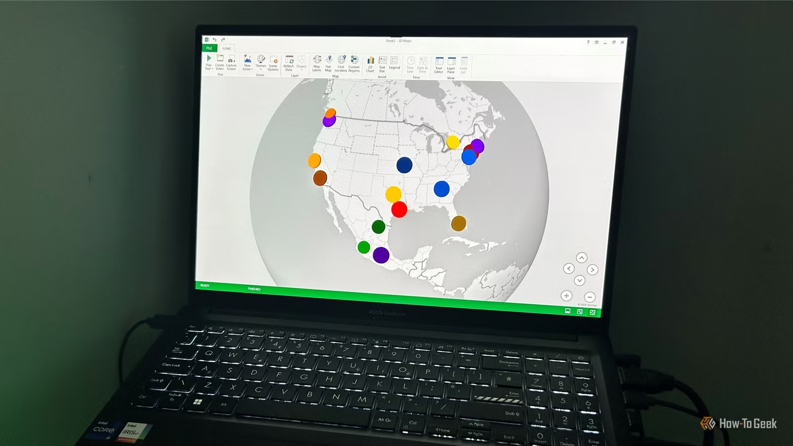
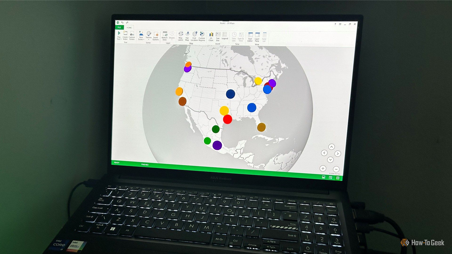
If you want to view your data from a completely different perspective, Excel’s 3D Maps tool lets you swap flat grids for a fully interactive, three-dimensional globe. It’s an easy way to turn basic geographical data into an interactive visualization that’s more engaging than a standard spreadsheet. This project is ideal for plotting a road trip, mapping World Cup stadiums, or visualizing all the places you’ve visited in a way that’s much easier to understand than a table.
Step 1: Create your table
- Make sure your data has recognizable geographic locations (cities, ZIP codes, states, or countries) and at least one numerical value, such as population or stadium capacity.
- Select any cell in your dataset and press Ctrl+T (or click Insert > Table) to convert your data into an Excel table.
- Check My table has headers, then click OK.
Step 2: Open 3D Maps
- Click anywhere inside the table, then open the Data tab.
- Click 3D Map (or Data Model > 3D Map, depending on your version of Excel).
- If this is the first time you’ve used the tool, click Enable when prompted.
Step 3: Add your location and value fields
- Excel will usually recognize your geographic fields automatically and select the most specific one (such as ZIP Code) for the Location box. If it doesn’t, drag the appropriate column from the Field List into the Location box. If the map remains blank, make sure Excel has identified your locations correctly.
- Drag your numerical field into the Height box to create 3D columns.
- If you want each data point on the map to be a different color, drag a categorical field into the Category box.
As you do this, your map will start to take shape.
Step 4: Change map types and explore the globe
- Use the visualization buttons at the top of the Layer Pane to switch between columns, bubbles, and heat maps.
- Change the Size and Thickness Layer Options so that the visuals look as clear and high-quality as possible.
- Rotate, tilt, and zoom the map to view your data from different angles.
Step 5: Polish the finished map
- Apply a theme, then turn on Map Labels or a Legend if needed.
- When you’re happy with the result, click Capture Screen to copy the finished map into your main workbook or another document.
OS
Windows, macOS, iPhone, iPad, Android
Free trial
1 month
Microsoft 365 includes access to Office apps like Word, Excel, and PowerPoint on up to five devices, 1 TB of OneDrive storage, and more.
Build a heat map that reveals trends instantly
Use conditional formatting to highlight trends at a glance
Heat maps aren’t just for spreadsheets full of figures. By applying a conditional formatting color scale to any range of numerical values, you can turn worksheets into intuitive visualizations that reveal patterns at a glance. Whether you’re highlighting the areas of a soccer pitch where goals are most often scored, tracking a habit calendar, or comparing monthly spending, the colors do the hard work of telling the story.
Step 1: Create your layout
Arrange your numerical values in whatever layout best represents your data. This could be in an Excel table column or something a bit more creative, such as a calendar, a timetable, or even under a soccer pitch overlaid as a PNG.
Step 2: Apply a color scale
- Select the range containing the numerical values. Don’t worry if some cells are blank—they simply won’t be colored in the heat map until a number is added to them.
- Open the Home tab.
- Click Conditional Formatting, hover over Color Scales, and choose one of the preset two- or three-color gradients.
Excel immediately colors each cell based on its value.
Step 3: Customize the color rules
- If the default colors don’t quite fit, click Conditional Formatting > Manage Rules.
- In the dialog box that opens, double-click the rule you want to customize.
- In the Format Style menu, decide whether you want a two-color or three-color scale.
- If you go with a two-color scale, choose colors that represent your minimum and maximum values to best suit your data. For three-color scales, you can also choose a midpoint color.
Step 4: Hide the numbers
Sometimes, heat maps look better and are easier to read if the numbers are hidden. A quick number formatting trick lets you do just this:
- Select the cells.
- Open the Number Format dialog box (Ctrl+1).
- Select Custom from the Category list in the Number tab.
- Type ;;; (three semicolons) into the Type field, then click OK.
- For an even cleaner look, open the View tab and uncheck Gridlines.
Replace chart columns with images and icons
Create eye-catching infographic-style visuals
Standard column charts communicate data well, but they don’t always grab attention. Replacing the bars with images or icons is an easy way to create infographic-style visuals that are both informative and memorable. These charts work especially well in presentations, social media graphics, and school or personal projects where you want your data to stand out at a glance.
Step 1: Create a column chart
- Format your data as an Excel table (Ctrl+T or Insert > Table).
- Select any cell in your data table and open the Insert tab.
- In the Charts group, select a standard 2D Clustered Column chart.
Step 2: Prepare your image or icon
- Anywhere in the worksheet, insert a picture (Insert > Picture) or icon (Insert > Icons). If you want every chart column to use the same graphic, choose one that matches your chart’s theme. Otherwise, insert the image or icon you want to use first.
- Crop away any empty space around the edges using the Crop tool in the Picture Format tab.
- Right-click the graphic and select Copy, or press Ctrl+C.
Step 3: Replace a column and repeat for the others
If you want a different image or icon for each column:
- Click any column once to select the whole series, then click the same column again (not a double-click) to select just that column.
- Press Ctrl+V to paste your copied image directly into that column space.
- Repeat these steps for the remaining columns.
On the other hand, if you want to replace all the columns with the same graphic, rather than clicking a column twice to isolate it, simply click it once to select the whole series, then paste the image using Ctrl+V.
Step 4: Finish the infographic
Format your chart—like removing gridlines, adding data labels above your icons, deleting unwanted axis values, or experimenting with different backgrounds—to create a chart that’s both informative and eye-catching.
Keep the momentum going
These projects show that Excel can be just as creative as it is practical. If you’ve still got time this weekend, continue experimenting with last weekend’s Excel projects, where you’ll build a travel planner, create a home inventory, and pick up a few more useful spreadsheet techniques in under an hour.
