

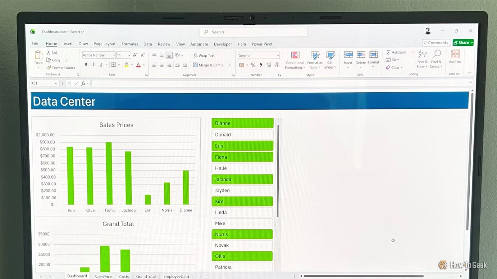
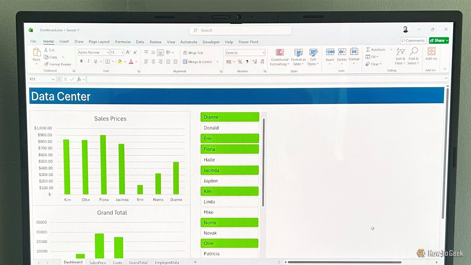
Excel is built for working with data, but large tables of numbers can be difficult to scan quickly. Fortunately, you don’t need advanced design skills to make your spreadsheets more informative. Whether you’re building quick reports or more advanced dashboards, these simple visualization techniques can help you spot trends, summarize data, and present information more clearly in minutes.
All the examples in this article use Excel tables (Ctrl+T), which automatically expand, keep formulas dynamic, and help related charts and visuals update when your data changes.
Build a simple column or line chart from your data
Turn your figures into a graph with minimal effort
A chart is the fastest way to turn raw spreadsheet data into something visual, and Excel tables make this process straightforward.
- Select the specific columns you want to visualize (for example, just your “Product” and “Profit” columns).
- Open the Insert tab.
- As a starting point, select either a Clustered Column chart (to compare values across categories) or a Line chart (to show trends over time).
After you select the chart type, Excel generates a basic visual representation of your selected data.
You can then format your chart by right-clicking any chart element (such as bars or axes) and selecting the contextual Format option. Alternatively, use the + button (the Chart Elements menu) to quickly add or remove things like titles, labels, and gridlines.
Want to skip the menus entirely? Select your data and look for the Quick Analysis icon in the bottom-right corner (or press Ctrl+Q). This tool lets you instantly preview and create charts, sparklines (more on these shortly), or totals with a single click.
Summarize large data sets with a PivotTable and PivotChart
Group your data automatically
Standard charts work well for small tables, but for large datasets, you can summarize everything with a PivotTable and instantly visualize it with a PivotChart.
To set up this dynamic duo:
- Select your Excel table, then click Insert > PivotTable.
- Choose where to place the new table. I always select New Worksheet so there’s a clear separation between raw data and visualization.
- Drag your categorical field (such as Product or Country) into Rows and your numerical field (such as Sales or Profit) into Values—and watch your PivotTable take shape in real time.
- Select a cell in your newly created PivotTable.
- Navigate to the PivotTable Analyze tab and click PivotChart to generate the graphic.
You now have a dynamic PivotTable that automatically summarizes your data and a linked PivotChart that visualizes it in real time as you adjust the underlying structure.
OS
Windows, macOS, iPhone, iPad, Android
Free trial
1 month
Microsoft 365 includes access to Office apps like Word, Excel, and PowerPoint on up to five devices, 1 TB of OneDrive storage, and more.
Add interactive slicers for dynamic dashboard filtering
Provide visual navigation controls
A static chart only shows one slice of data at a time. To make your charts truly interactive without forcing users to navigate clunky drop-down spreadsheet filters, you can build a visual dashboard interface using slicers.
To add visual controls:
- Select your Excel table, PivotTable, or PivotChart and open the Insert tab.
- Click Slicer.
- Check the boxes for the specific categories you want to filter, such as regions, dates, or employees, and click OK.
- Position the floating menu of clickable buttons right next to or above your table or chart.
Anyone viewing the spreadsheet can now click to filter the data visually in real time.
Hold Alt while moving or resizing your slicers to snap the edges to the Excel grid, keeping everything in-line and professional.
Use in-cell Sparklines for compact data trends
Track changes in a single cell
A full-sized chart is not always the best fit for your spreadsheet layout, especially if your spreadsheet is already on the verge of looking over-cluttered. Sparklines solve this by drawing miniature line or bar graphs directly inside cells.
To create these micro-charts:
- Create a new column in your table named Visual.
- Select the columns you want to visualize.
- Open the Insert tab.
- In the Sparklines group, click Line, Column, or Win/Loss.
- Activate the Location Range field, then select the Visual column.
When you click OK, Excel inserts a sparkline into each cell of the Visual column, summarizing the pattern for each row.
To increase the size of your sparklines and make them easier to interpret, increase the row heights and column widths of their host cells.
Highlight trends with conditional formatting color scales
Design an instant heat map
Color makes it easier to spot patterns that might otherwise be buried in a large table of numbers. Turning a large grid of financial or performance figures into a color-coded heat map allows anyone to scan the sheet and spot highs and lows in a few seconds.
For a cleaner heat map effect, open the Table Design tab and uncheck Banded Rows. This prevents alternating row colors from interfering with the conditional formatting.
To generate a clean heat map:
- Select your target numbers in the data table.
- Click Conditional Formatting in the Home tab.
- Hover over Color Scales, then select one of the default options or click More Rules to choose your own colors.
Excel then applies a color scale to the selected range.
Build custom bar charts using the REPT function
Create lightweight text-based graphics
While Excel includes built-in data bars under the Conditional Formatting menu, they can feel restrictive if you want more control over the final look. Instead, you can use the REPT function to build charts out of solid text blocks.
To build formula-based bars:
- Add a column to your table named Visual.
- Select your new Visual column, and change the typeface to Playbill or Britannic Bold. These squish the individual characters into a solid bar without spaces.
- In the first cell, type: =REPT(“|”, ROUND([@Score],0)) where [@Score] is the column you want to visualize, then press Enter to generate the block graphic. If you’re using an Excel table, the visualization automatically expands down the column and updates as new data is added to the table.
- Select your preferred font color or apply a conditional formatting rule to complete the look.
Nesting the reference inside the ROUND function converts decimal values into whole numbers before Excel repeats the character.
Because this is a text-based visual, you may need to scale values up or down depending on the numbers. You can do this by dividing or multiplying the column reference by a given number, such as 10:
=REPT(“|”, ROUND([@Score]/10, 0))
or
=REPT(“|”, ROUND([@Score]*10, 0))
The key is to ensure you apply the same operation all the way down the column so the visualizations are directly comparable.
Level up your charts to avoid the standard “Excel” look
Excel charts work well out of the box, but they become far more useful when you combine them with formatting tweaks, formulas, and alternative visualization methods. For example, you can modify a line chart to create a dynamic timeline, use pictures and icons as chart columns, or leverage conditional formatting and simple formulas to build a dynamic Gantt chart.
